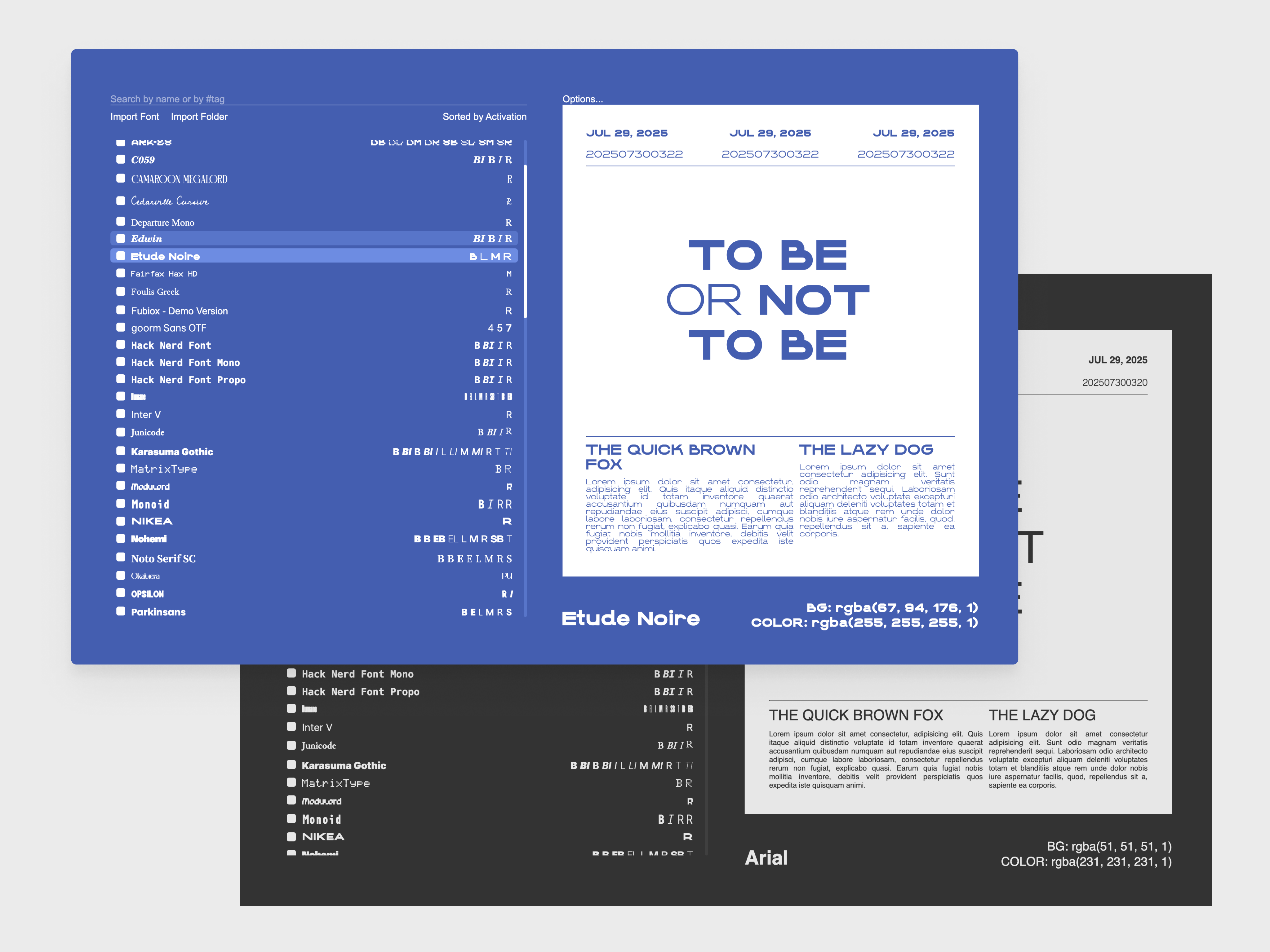
ASCENDER

Fast font management
and visualization

Today is
Tue Mar 11 2025

Last updated
Thu Oct 17 2024

Ascender

team:
INDIVIDUAL PROJECT

role:
UI/UX DESIGNER, DEVELOPER

tools:
FIGMA (DESIGN), ELECTRON, REACT, TYPESCRIPT, TAILWIND CSS

TIMELINE:
3 MONTHS, (AUGUST 2024 – PRESENT)

SUMMARY

Typography is everywhere. It covers books and papers and helps add character to written messages. It lives on screens and on walls, on signs and billboards. The prevalence of typography makes it go unnoticed in most cases, yet when presented with poorly chosen fonts and typefaces, people will immediately notice. The importance of type choice makes choosing the correct one for any project difficult. I aimed to make this process easier by developing an app that helps users preview different font layouts quickly and enjoyably.

SOME BRIEF BACKGROUND

This project didn't start out as an app idea. I had wanted to find a good way to store all the random font files strewn across my hard drive, so I researched different font management apps to see which one would solve my problem. As I tested each alternative, I found that the feeling of disorganization I had did not come from the fact that the font files were not in one place. Even with a good file management system, I still felt resistance when searching for a good typeface for any given design. The problem was the overhead of having to test out each font 'in context' to see how it would look. This was because: 1. creating mock designs for different fonts took too long in most vector-based design software 2. often, designs depend on the typefaces used. Designing first and testing the typeface later often resulted in the design having to be readjusted multiple times before working well with the paired font

BEFORE WE CONTINUE

This app would also be my first experience in designing from a functional perspective. I didn't yet know about user-centric design, so certain areas (i.e. user research) are limited to the internet forums and feature suggestions for major competing applications.

BRAINSTORMING

IDEA 1: INLINE FONT VISUALIZATIONS

For this idea, users would be able to 'expand' the details for a given font in a google fonts-like interface. Many font and design websites like Google Fonts and FontShare use a feature like this. Despite providing a more comprehensive view into one font, it still prevents users from seeing the font being used in context. Sometimes, a font might look stunning when enlarged and isolated on the Google Fonts page but look out of place and strange when used in on a website or poster.

IDEA 2: SPLIT FONT DISPLAY

I placed a much greater emphasis on the visualization aspect. Users have a small inline view to see their fonts, and large, preview box that displays different font styles and sizes of a given typeface.

I chose to explore Idea 2 more because it gives the user more visual feedback about how a given font would look alongside text and other elements. Here, visualization is prioritized over information for an individual font.

IMPLEMENTATION

DESIGN

In my mind, the biggest reason for using Ascender would be for visualization and mocking up fonts. Other secondary (but still helpful!) features like importing and managing fonts are lower on the information hierarchy.

TECHNICAL

For the development of the minimum viable product, I used Electron, React, TailwindCSS, and typescript to create the app. I used OpenTypeJS for access to the font data and did most of the data processing on the 'backend' side in Electron. A notable challenge was trying to figure out how to use OpenType to accommodate for different naming systems and font files. Since there's no standardized practice for what to call different types of styles (i.e. Bold, Black, Very Bold, Ultra Bold, Thick...you get the idea), I had to manually catalogue most of the common font family names to store the typeface's font styles properly.

USER FLOWS (WIP)

Currently, this project is undergoing some major redesigns. While not representative, this early diagram I created is roughly what I had in mind for two of the user flows: Adding and saving fonts, and changing the settings for the app

Ascender

ADDING AND SAVING FONTS

When adding a font, I identified two user flows: the first is a single file. Many variable fonts, like Inter, have all font variants contained in a single file. Users adding a single file can choose to “import file”, which then brings them to a dialog showing a detailed description for one font. However, for many display fonts from sites like Fontesk, styles are separated into multiple files. It would be cumbersome to open a dialog for every font in a typeface, so I also included the option to import all fonts contained within a folder. This creates a modal popup with a scrollable area for each font to be imported. Often, some types may be sans-serif but have a book or condensed style that is serif. To account for these options, I chose to include separate tag fields for each font, to give the user greater control over each style

SETTINGS

I wanted to also handle some basic settings for the app. These include color adjustments for the foreground and background, as well as layout preferences and font-related customizations.

FUTURE PLANS

As mentioned, this app is still being actively developed. The most urgent plan is to conduct user interviews with print and graphic designers, and reevaluate my designs based off their pain points. My personal goal is to also rethink the current layout for mocking up fonts. Currently, the mockup layout is hard coded, but I plan to expand the possibility for user customization.